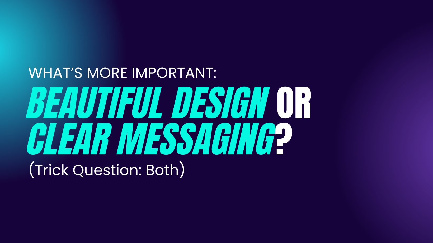
Nonprofit Design and Messaging: Why You Can’t Choose Just One
Picture this.
A nonprofit’s website homepage. Two versions.
One is visually stunning—gorgeous photography, elegant typography, smooth animations. But the message? Vague. Generic. No clear call to action.
The other? Not exactly a design masterpiece. But the nonprofit design and messaging is crystal clear—who they help, why it matters, and exactly how you can get involved.
Which one wins?
Neither.
Because here’s the truth: Design without clear messaging is empty. Messaging without good design gets ignored.
Too many nonprofits treat these as separate battles—”Should we invest in making our materials look better or focus on refining our message?” The answer is always both. Because when done right, great design amplifies great messaging.
Why Good Design Alone Isn’t Enough
Nonprofits often assume that if something looks professional, it will automatically connect with people. They invest in fancy logos, sleek websites, and high-quality brochures—only to realize that donors and supporters still aren’t engaging.
🚨 What’s missing? A clear, compelling message.
If people land on your site and think, Wait, what does this nonprofit actually do?, you’ve already lost them. A beautiful design might impress them for a second, but if the messaging doesn’t immediately grab their attention, they’ll move on.
💡 Example: A nonprofit fighting food insecurity like Feeding America has a stunning website. But if their homepage simply says:
“Ending Hunger, Changing Lives”
…it’s not enough.
Compare that to:
“1 in 5 families in our community struggle with hunger. Your $25 donation provides 10 meals. Join us in feeding families today.”
Now, the mission is clear, urgent, and actionable.
👉 Good design may get people to stop and look, but clear messaging makes them care and take action.
Why Strong Messaging Alone Isn’t Enough
Now, let’s flip the script.
What if your nonprofit has an incredibly powerful mission statement, compelling statistics, and impactful storytelling… but your branding and design look unpolished, outdated, or confusing?
🚨 Here’s the problem: No matter how strong your message is, if it’s visually unappealing or hard to navigate, people won’t engage with it.
💡 Example: A nonprofit like The Kennedy Ladd Foundation shares powerful stories and support, but it’s the clean, welcoming design that invites people in to stay.
👉 Strong messaging alone won’t save bad design. The way your nonprofit’s design and messaging looks and feels matters just as much as what it says.
The Secret: When Design and Messaging Work Together
The best nonprofit brands don’t choose between design and messaging—they integrate both seamlessly to create an experience that feels powerful and persuasive.
1. Clarity First, Beauty Second
✅ How to apply it:
-
Write your headline first, then design around it.
-
Make sure the most important message is the most visually dominant.
-
Use hierarchy (bold headers, clear sections) to guide the reader’s eye.
💡 See how Feeding America leads with urgency and simplicity.
2. Use Visuals That Reinforce Your Message
✅ How to apply it:
-
Use real faces—people connect with people.
-
Choose images that support your message.
-
Cut anything that distracts.
💡 Malala Fund pairs stories with stunning, authentic photos of the girls they support.
3. Make Calls to Action Impossible to Ignore
✅ How to apply it:
-
Place high-contrast CTA buttons (like “Donate Now”) in prominent places.
-
Use specific, active language.
-
Repeat the CTA.
💡 World Wildlife Fund nails this with their “Adopt an Animal” campaign.
4. Keep It Skimmable and Engaging
✅ How to apply it:
-
Break up text with subheads and bullets.
-
Use white space strategically.
-
Design with mobile users in mind.
💡 MAP International’s clean home page is a masterclass in clarity and emotional connection.
So, What’s More Important? Neither. You Need Both.
A well-designed nonprofit brand with weak messaging is an empty shell—it might look great, but it won’t inspire action.
A nonprofit with a strong message but poor design is like a great book with a terrible cover—people won’t take it seriously.
✅ Good design captures attention.
✅ Strong messaging holds that attention and drives action.
When both work together? That’s when nonprofits create movements.
Your Nonprofit’s Challenge:
Look at your website, flyers, donation pages, and social media. Ask yourself:
-
Is the message immediately clear?
-
Does the design support and enhance the message?
-
Are we making it easy for people to take action?
If any of these are missing, it’s time for a refresh.
Need help blending powerful messaging with bold, modern design? HOLY SH*FT! can make it happen.
Because your mission deserves to be seen and understood.